KGP Packaging
When I first began putting together my packaging, I wanted
something that left my clients feeling special.
I knew I wanted more than just handing someone a Disc and calling it a
day. I am a die-hard researcher, so this
process took many months. There were so
many things to consider. What would my
colors be? What should my logo look
like? Where do I even purchase
boxes? Should I go green? No matter what the question…I think I pulled
all aspects together nicely.
I started with the Logo. I felt this was the most important and the
one thing that would remain consistent throughout my career. I knew I wanted something more on the vintage
side. That’s when my friend Roxy and
owner of Stella Jewelry suggested I look into Michelle Baron. She had illustrated a blog header for her and
she was very pleased. I will save my
experience creating my logo and blog header in a later blog; however, I felt it
important to state that this was the beginning for everything.

Once I had the logo down, it was time to choose packaging materials. I knew I wanted it to feel quirky and vintage with a hint of country. I also knew I wanted to use green products as much as possible. That’s when I heard about Scott with Packaging Works. During our first meeting we spent a long time going through many storage boxes. Believe it or not finding the perfect Kraft Box is more difficult than you think. It had to be sturdy enough to hold things like prints and photo albums. I settled on large Kraft boxes. These were the perfect size for the Kraft folders I found at Kraft and Jute. I loved how they had multiple pockets to store all the important things. To tie the closed package together I chose a robin’s egg blue and Kraft raffia.

When it came to Disc storage I had a few options. I finally chose these metal tins with a clear
window. I felt it was a great “go green”
option because it was sturdy, would never bend, was easy to clean,, and could
be reused or store up to 5 CD’s inside. I also went with a chocolate brown recycled
crinkle paper to fill the boxes.

I enclose a handful of business cards tied together with
twine to make it easier to refer me.

I also include a tri-fold pamphlet for future sessions or to
give out.
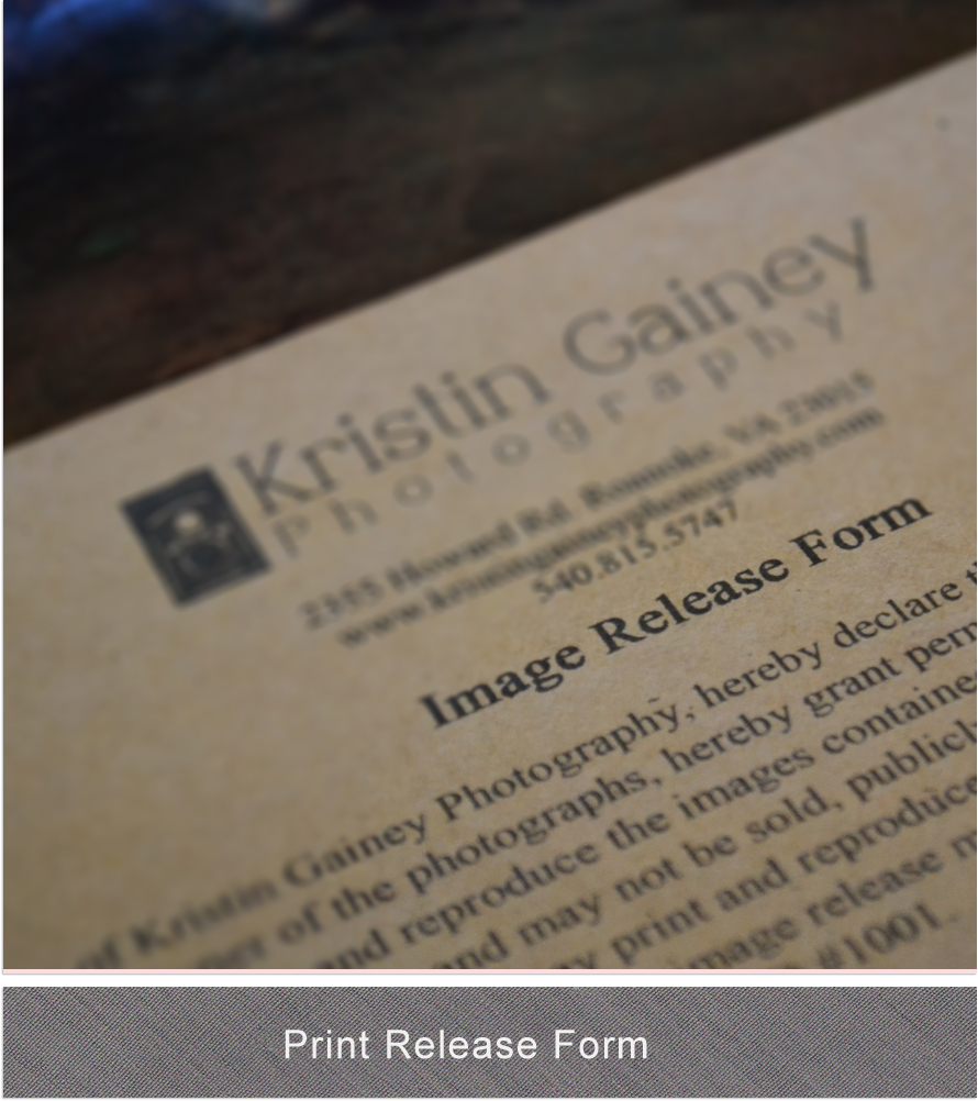
Your package includes an Image Release so that you can print
your images anytime. I chose a thick
Kraft paper for this. Although I include
the print release on your disc…I like to have a signed copy as well.

I offer a Referral Program, because let’s face it word of
mouth is key in this business. The more
past clients refer me…the more credits you receive. These are given out to any past client.

I also wanted to offer a special treat with all my
packages. I considered cookies,
brownies, to mini Coke bottles. I then
thought it may be cool to have personalized M&M’s. I was able to use the camera from my logo. I also chose to have words like cheese, thank
you, and smile placed on them. I love
chocolate…so this was my favorite part and I feel ties everything together
nicely.
So there you have it! KGP packaging!
Over time I plan to add a bit more to these packages, but it’s
a work in progress and will happen eventually.
I’ve considered magnet calendars, bookmarks, and pens. Until then…I am very pleased to show off my
packaging and provide a true boutique experience.
Logo by: Michelle Baron
Kraft Boxes, Tags, Raffia, and Crinkle paper by: Packaging Works
Kraft Multi-Pocket Folders,Kraft Printer Paper by: Kraft and Jute
Tin Disc Case by: Am-Digital Packaging
Disc, Luxe Business Cards, Tri-Fold Brochure, and Scalloped Edge
Referral Cards by: Millers Lab
Personalized M&M’s by: My M&Ms
Photo Props & Table by: Plantagenet Rose

Comments
Post a Comment